In the context of architecture a precedent is a building or project from the past with something in common with the present project that offers an example of how similar issues have been addressed. Observing the built environment and studying the work of others are a crucial part of the design process, yet these are things most architects seldom discuss. We might talk about our favorite buildings or show some holiday snaps of some nice places in Italy, but when we get down to the specific influences on a particular project we are more cagey, perhaps through fear of being accused of copying, and no-one wants to be accused of that.
In the age of mass-media there is a constant pressure for novelty and designers queue up to proffer ‘new’ solutions and radical images to titillate an increasingly fickle audience. Technology moves on, we experiment with new techniques and new materials are invented, but the problems we are trying to solve have not really changed that much. A home still needs to provide security and shelter from the elements, a shop still provides a place to examine the goods we might want to purchase, a railway station still needs to allow us to get on and off trains safely. I imagine all designers would like to think they could improve a little on what has gone before, but an individual’s developments are always rooted in the work of those who have preceded them. I would argue that we are more able to create meaningful work for our age by trying to understand what people have done before and by making conscious connections with the achievements of the past.
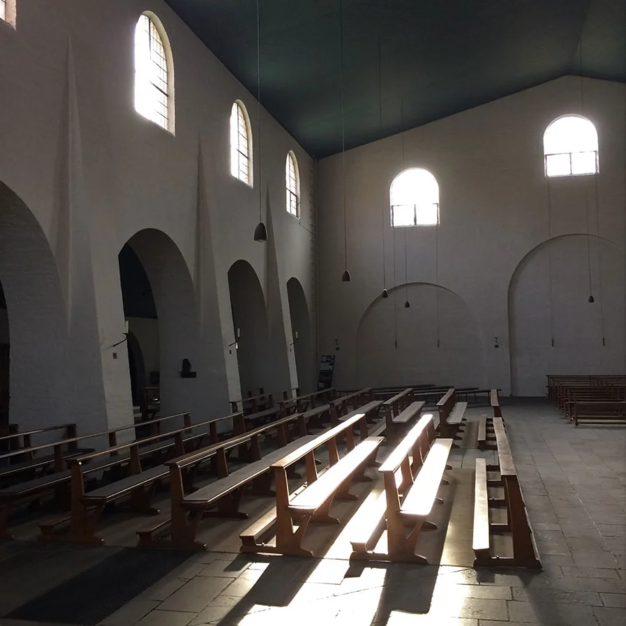
To illustrate how I work I am going to talk about the Newington Green House which was my home for 8 years before we moved to Somerset. It was the first building I designed completely on my own. Over the 2 years between buying the site and starting construction I experimented with various approaches, slowly discovered what my priorities were, and painstakingly hammered out a design that coalesced the spirit I wanted the house to have. Designing your first house must be like writing a first novel and the project can groan under the weight of all the ideas you have ever had, being forced into the confines of what is just a little house. One of the most important lessons I learned was to have a hierarchy of ideas. To make decisions, there need to be one or two that are the most important and which take priority over everything else. There can then be a next tier of ideas that are more important than the tier below them, and so on. if an idea cannot be made to work with those above it then it has to be rejected, or saved for another project.
Because it was my own house, I had the luxury of time to work things out, to let ideas sit for a while and to revisit them. The shell was built by a builder to a very low budget and I finished the work off myself over the next 3 years once I had moved in, with the help of various friends. That meant I could spend time refining details, saving up for things I thought would add value and making adjustments to things that didn’t work first time.
The site was very small, only 60 sq m, with a 7m street frontage, so it was always going to be a vertical house. By sinking the ground floor 1m below the pavement and having tight floor-to-ceiling heights, I got planning permission for a four storey house that was the same height as the adjacent three storey Victorian terrace. The brief was quite basic – a ground floor lounge/kitchen/dining space, a first floor bedroom and bathroom, a 2nd floor studio that would be my office and a roof terrace above. I found two great examples of small live-work buildings that I found myself constantly referring back to. The image below is a pair of houses at Thurlstone in Yorkshire with a shared weaving loft on the top floor (taken from Houses & Cottages of Britain by R W Brunskill). Putting the work space at the top of the house allows it to have the best light and to have large areas of glazing without the need to support additional floors above. One of the dangers of working from home is isolation and I was keen to have a big window overlooking the street where I could have a good view and people passing by could see me. There is something visually correct about the amount of masonry in the wall decreasing towards the top of a building as the load it has to carry decreases.

The second example is a house and studio on Turnham Green for the artist J W Foster by C F A Voysey (1891). There is a parlour and kitchen at ground floor, bedrooms on the first floor and the 2nd floor is given over entirely to a studio. As well as the arrangement of functions, it was also influential that both these examples are built of a single material, the Thurlstone houses of stone and the Voysey house of rendered masonry. For a small house I like the modesty of a single material, with only the windows expressed differently. Even though the elevation of the Newington Green house is not much bigger than the neighbouring terraced houses, the expanse of unadorned brickwork gives it a scale and presence disproportionate to its size in the streetscape. Voysey lured me into trying out more expressive roof forms but I retreated to a simple parapet which ties in with the neighbouring roofs.

The next example might seem a bit random, but bear with me! I took the photo below in Leh, Ladakh on the Tibetan plateau in the far north of India. There was a freak rainstorm that made the roads out impassable so I ended up spending three weeks there travelling out to the various monastaries that grow like tapering white crystals out of the parched, rocky landscape. They are made mainly of a single material, stone, which is generally left exposed or whitewashed, and sometimes painted deep red or ochre on important buildings. For security and defence there are very few openings on the lower floors but the windows get bigger higher up the building, with more timber embellishment of the openings. By the top floor there is often more opening than wall and the timberwork develops into an elaborate profusion of balconies and cornices.

Newington Green isn’t likely to be subject to Himalayan winters or a Mongol invasion but I was conscious that the house is built right on the street with no rear garden and next to a council estate. The local youth often climbed over our wall and hung about only a few metres from where we slept so I did feel that it needed to be something of a defensive structure. There is only a single window on the ground floor, protected by an adjacent wall, and the openings on the lower floors are positioned so the solid brickwork is dominant and gives a sense of protection. On the top floor though there is little danger of anyone climbing or peering in and this is celebrated with a wrap-around projecting corner window.
A danger of being influenced by another building is that you can bite off a whole piece of it and not digest it properly. I try to understand precisely what is relevant about a particular precedent and to extract the essence of it to add into the mix of my project. If this analysis is rigorous enough it doesn’t matter that the precedent comes from somewhere seemingly distant in time or place from my context, as long as I am only extracting what is relevant.

In my first design, the house was split into a concrete lower storey with a corten (rusted steel) box perched on top. I got planning permission for this, but soon realised it was going to be too expensive and I would have to look at a more simple means of construction. Meanwwhile I also started to feel uncomfortable that these materials would make the house too special, too attention-seeking. It would have been a strong piece of architecture, and perhaps an appropriate response, but in the end I felt that it just wasn’t me. I wanted to do something more modest, with a more subtle relationship to the adjoining Victorian terrace and the street. I became drawn to the idea of building a brick house.
The vast majority of houses in inner London are built from brick, mostly hand-made yellow stocks made from clay dug up from the fields adjoining the site. Bricks are now mostly machine made and I didn’t want to use reclaimed bricks so it seemed right to use a modern brick. A new yellow brick would be much lighter and yellower than the old stocks that have absorbed 150 years of soot and grime. A greyish-brown is distinct enough to be obviously new but would tone well with the dirty yellow stocks, and the red and grey pre-cast concrete panels on the council housing block that was our neighbout on the other side. Grey bricks have become very popular recently but at the time (2001) no-one was using them.
I found inspiration for the external expresssion of the house in several near-by council estates in Islington and other London boroughs. There were a number of estates built in the 1950s and 60s that were predominantly brick rather than the more common concrete. Building a large building from brick gives it a distinctive power, derived from the small size of the brick module relative to the vast expanse of wall. I can’t remember where I took the photo above, but it is part of 6 or 8 storey block of flats in north London. The windows and access decks give scale to the elevations while offering glimpses of the life within, but it is the juxtaposition of these with the blank elevation on the right that gives the building a powerful, even a sublime character. I tried to compose the elevations of the house to convey a similar feeling.

The way an opening is made in a wall affects the perception of the weight of wall. The bricks you see on the Newington Green House are just the outer leaf of a cavity wall so they are laid in stretcher bond to express their thickness which is only half a brick, or 102mm. The glass in the windows is flush with the brickwork rather than recessed, reinforcing the sense of the brick as an outer skin. In a Victorian brick house the windows were often emphasised with external mouldings that add a secondary layer of detail and were used to alter the scale of the window opening relative to the elevation as a whole. A similar idea is apparent in some buildings from the 1950s, where a simplified moulding was used like a picture frame, suggesting a hole cut through the wall to reveal what is happening inside. The example below is a bakery in Great Sutton Street, Southwark, with a wonderful blue-painted moulding that emerges from the brickwork, defines a snug doorway, loops around to frame a display of baked goods and then flicks in to lead you into the shop. So much is achieved by manipulating a simple section of timber. The shopfront is sadly no longer there.
For the windows of the Newington Green House I pinched this idea. The house is very close to the pavement and, rather than putting up the shutters all the time, I enjoyed offering passers-by a glimpse of life inside. The windows have a chunky Douglas fir moulding on the outside that frames the view in and a thinner birch plywood lining on the inside. The windows are like cookie cutters that have been pressed into the brickwork to cut out the openings.


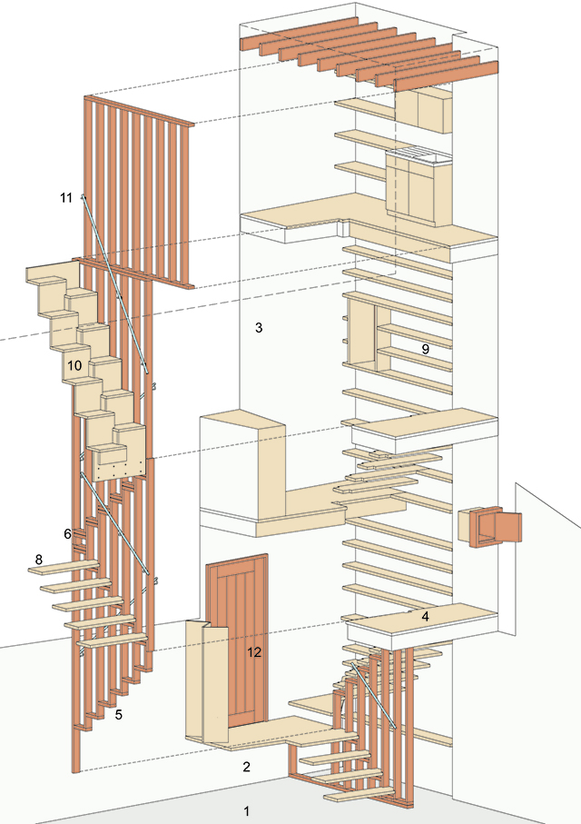
Inside, the house is very compact. The site is an awkward shape and only measures 8m on its longest dimension. To increase the sense of space I wanted to have as few doors as possible and leave the spaces as open as possible. We aren’t the tidiest of people, so to avoid the house silting up with stuff there need to be lots of places to keep things. Rather than just putting stuff everywhere I decided that there should be some small spaces that have loads of storage and shelves so that the larger spaces can potentially be free of clutter. By making the small spaces feel smaller and more busy and the large spaces calmer and more empty, the contrast between them is enhanced and the house feels more spacious, and spatially varied.The inspiration for this idea came from one of my favourite places in London, Sir John Soane’s Museum. None of the spaces in there could be said to be free of clutter, but it is the way the smaller spaces work that intrigued me. The linking spaces, anterooms, and lobbies are all richly encrusted with items from Soane’s collection. There are concealed rooflights with coloured glass, mirrors and views into adjoining spaces. The intricacy and care with which these little rooms have been treated, and their use for display allows the main rooms to have a more controlled character, equally complex, but different.In a small house the staircase takes up a disproportionate amount of space for the amount of time you spend in it. In the Newington Green House I made the staircase into a vertical walk-through space for storage and display. There is a bike store below the stair, a coat cupboard by the front door, a linen cupboard on the next landing and a utility room with a washing machine and washing lines at the top. There are shelves all the way up, for shoes at the bottom and books above.


I found the cupboard in the photo below in a disused print works in Leeds that I was working on when I had a proper job. The shelving is made of hardwood, with a care you don’t see these days in back-of-house areas. I love the way the shelving has been made to fit perfectly with the stone steps of the staircase, and it gets wider towards the front to make it easier to get in. There are no sharp corners and the shelves are rounded where they step in and out, showing the understanding of the person who made them that it was going to be an awkward space to use without banging your head or elbow occasionally. There is something parasitic about it, like it has grown there in a way unique to the space. I wanted the joinery in my staircase to feel like this.